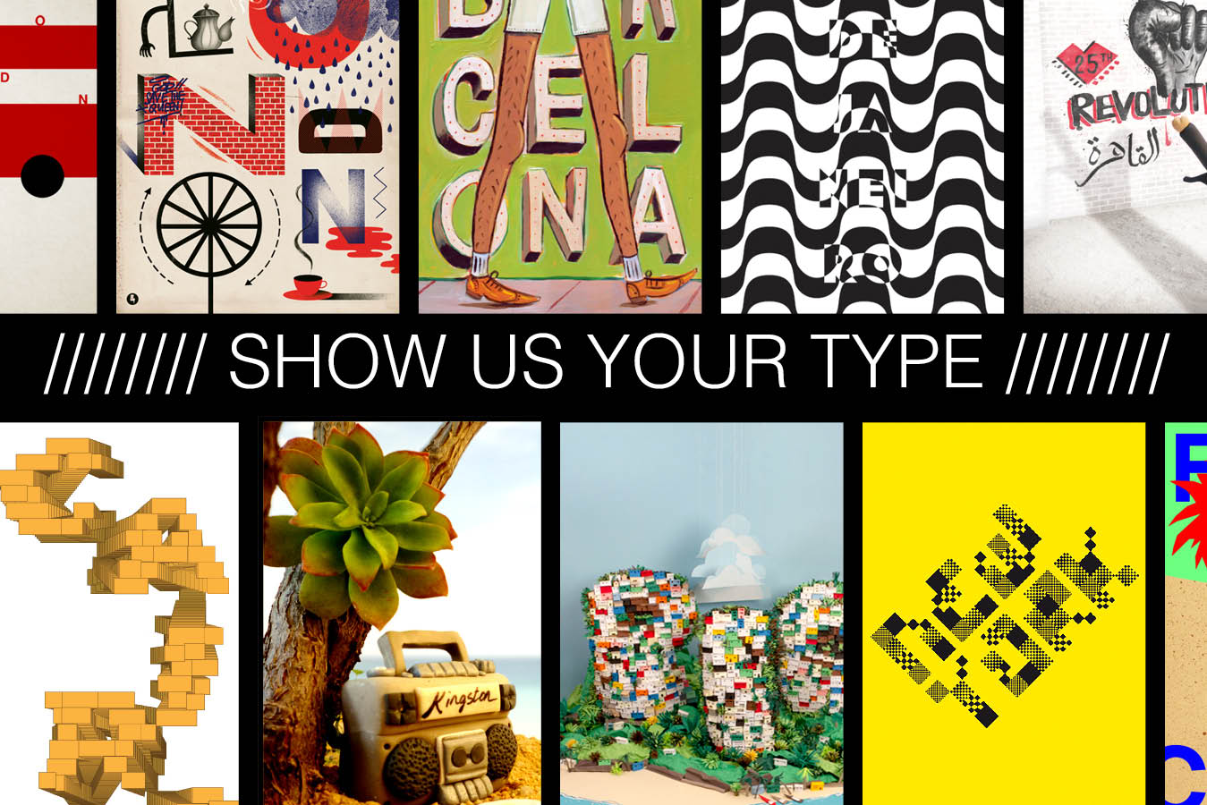
Website “Show Us Your Type” is where design and typography meet.
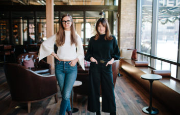
interview and photo illustration by Jillian Deutsch
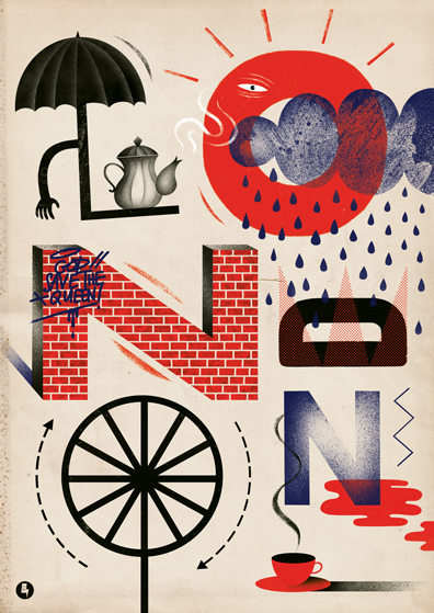
Most people see city names in unremarkable places, but a popular project is giving viewers a different way to see cities across the world.
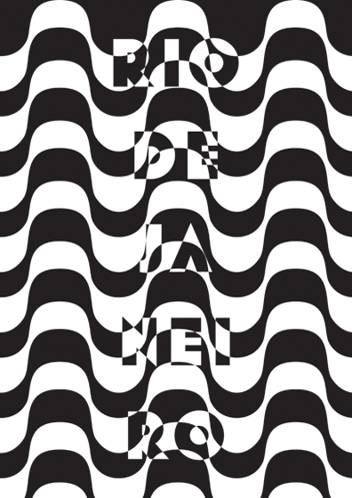
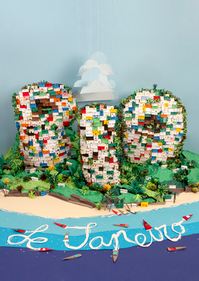
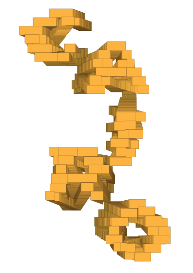
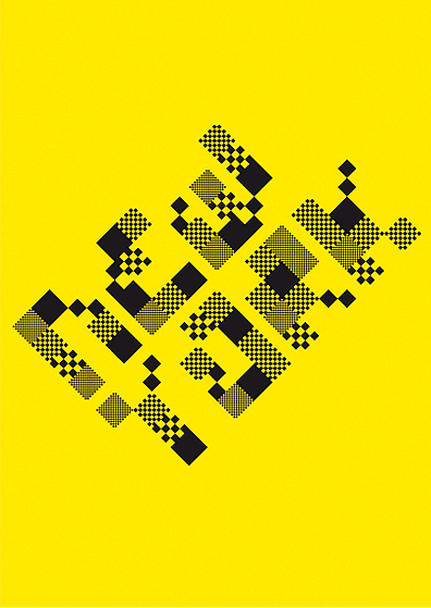
“Show Us Your Type” is a global design collective that pools designers from around the world to create posters for a chosen city. The contest begins three to four times a year when Natalie Long and Lisi Badia, the curators and creators of the site, select a city (from Rio de Janiero to Mumbai and, most recently, Reykjavik), and then, designers from around the world get to work. Whether it’s hand-drawn on paper, constructed in Photoshop or photographed with a camera, designer use typography and art to create a visual that evokes the spirit of that place. When the submission date is over, Long and Badia choose the best of the best that then go on on the website, and sometimes in a gallery showing.
This global project was begun by two women who have lived in many different time zones Long is originally from Adelaide, Australia, and Badia from Barcelona. The two met when they were working as art directors in Barcelona on projects for Nike, Audi and Kandoo. When Natalie moved to New York, the two sought a way to still work together but “under their rules.” What they did was combine their two great loves — typography and travel — into one collective design project, now in its sixth year. Long and Badia spoke with me together over email about the project’s process and its effect.
[slider navigation_style=”both” custom_slider_transition=”move”]
[slide]
[/slide]
[slide]
[/slide]
[slide]
[/slide]
[slide]
[/slide]
[slide]
[/slide]
[slide]
[/slide]
[slide]
[/slide]
[slide]
[/slide]
[slide]
[/slide]
[slide]
[/slide]
[slide]
[/slide]
[slide]
[/slide]
[slide]
[/slide]
[/slider]
Jillian Deutsch: What’s the goal of “Show Us Your Type”?
Natalie Long and Lisi Badia: We want to inspire other designers through typography and design and explore the world through the lens of the community.
JD: How do you choose the cities featured in “Show Us Your Type”?
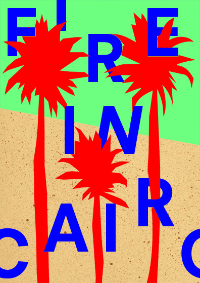
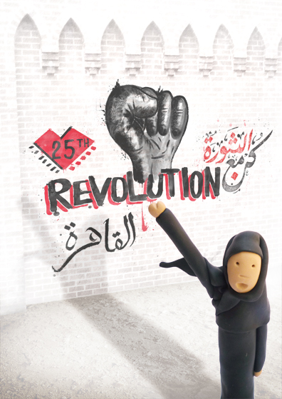
NL and LB: It’s sometimes driven by events; for example, the movement in Cairo inspired that edition. Or very simply, it’s a city we have a lot of curiosity about and would love to see how the world interprets the city.
JD: What is the submissions process like? Are there main guidelines? How do you find the designers to participate?
NL and LB: In the early stages of the project, we sent literally hundreds of email[s], and we are really thankful to those initial designers who dedicated their time and energy for a nonexistent website at the time. Thanks to our first edition featuring amazing artworks by amazing designers who believed in our project, we grew very fast.
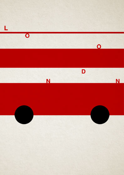
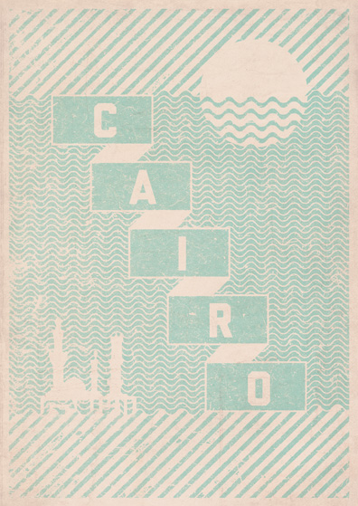
The only guideline is that the poster needs to feature the name of the city, but it can be displayed any which way. We would love to post all of the designs, but we want to keep the quality high and inspire other designers to really push their designs.
JD: How many submissions do you get? Does it vary by city? What have the most popular cities been?
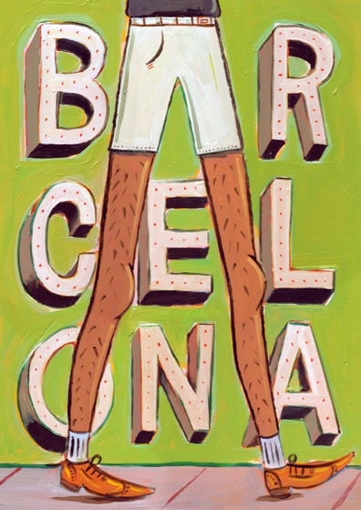
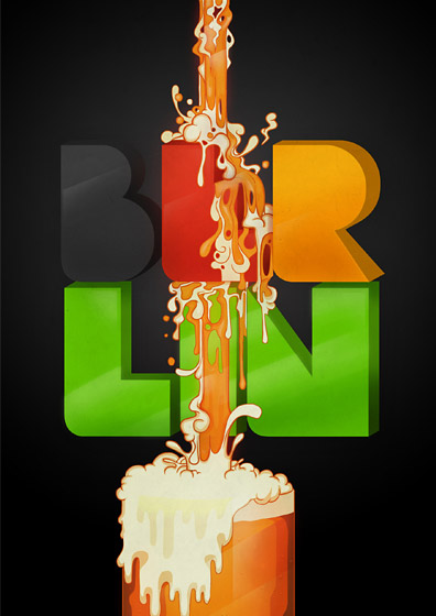
NL and LB: It does vary by city, and we generally receive more submissions for better known cities. Popular cities have been Berlin and Hong Kong.
JD: What ways do the designers create their type?
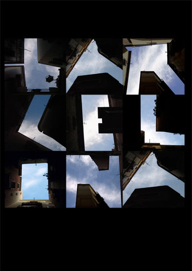
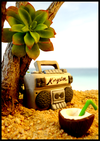
NL and LB: The great thing is that it ranges from all different mediums, from photography to hand drawn to photoshop. One of our favorite posters was created with clay. Amazing the attention to detail and time.
JD: How do designers come up with the type and designs that represents that city’s personality?
NL and LB: It ranges from all different spectrums. For Berlin, a lot of common themes were visited such as the bears and sausages, but then we were really surprised by many of the entries that portrayed Berlin from a new perspective. It’s amazing to see how the cities are interpreted, many times from designers who have only seen images and never before visited the city.
JD: Do most of the designers live in the cities for which they design posters?
NL and LB: Definitely not, for each poster we place the name and location of the designer and 90 percent of the time the designer isn’t from that city — or country.
JD: That’s so interesting that some designers have never been to the city for which they’re designing posters. What compels them to depict a city to which they’ve never been? Do they base it off photographs mainly?
NL and LB: The Internet has opened up new worlds and adventures for everyone, and now with technology, you can really get a sense of a place without ever having stepped a foot in the country. Movies, stories from friends or families, favorite bands from there — there are so many possible ways that culture has seeped [its] meaning into our consciousness. Our designers research, pull from memories or simply get inspired by a place. Ithaca, for example, is a very small island off Greece, and the submissions fit perfectly.
JD: Has social media helped make this a global project?
NL and LB: Very much so, our submissions come from all corners of the world. We are very thankful for the community in supporting, sharing and celebrating our site. Without their support we wouldn’t have had the ability to take our online project into the real world and hold nine physical exhibitions across the globe.
JD: Cities use (typography) all the time — subway maps, road signs, buildings. But these are typically for function. Why is it important to have type that is representative of a city’s personality, rather than just function?
NL and LB: We love type with a purpose in our day-to-day lives and have a great appreciation for beautiful, clean, clear signage, but type can be so expressive, and it’s fun to use it as a medium to explore a city or any topic.
JD: It’s interesting to me that even within one city, each piece is so different, yet they all evoke the same vibe of the city. How do they function when they’re all shown together?
NL and LB: That’s one of the interesting facets to our project. Many cities already have a global consensus in some regards. Preconceived notions, historical significance and popular culture have all had an impact on the perception of some of these cities. We sometimes see that played out in the submissions, but [we] like to think that it’s still subjective and personal to each person who views the galleries.
JD: How does a city’s history and culture affect the posters? Do you have examples of this?
NL and LB: Ithaca is a great example, as it is surrounded by mythology and the story of Odysseus, so it was a great source of inspiration for the designers and you can really see this influence amongst the posters. A city is very much a character with its own traits. Everyone forms their own opinion, like in real life, based on truth or fiction. It’s this global, yet personal, perception that tends to spark the creativity.
[hr style=”striped”]
Jillian is one of the editorial assistants at The Riveter. She’s currently studying journalism and women’s and gender studies at the University of Missouri. When she’s not reading feminist blogs, longform journalism or nonfiction novels, she’s probably looking at photos of cats or dreaming of French baguettes. You can catch her on Twitter or @JillianDeutsch on Instagram.